marketopia
The challenge
Marketopia helps brands make an impact at the point of purchase, so it made sense for their identity to communicate the strategic and flexible nature of what they do. They needed a brand that could feel professional without becoming too corporate or rigid.
The Strategy
We focused on movement and adaptability. Marketopia works with different brands, different challenges, and different audiences, so their identity needed to have that same ability to move and adapt.
the creative solution
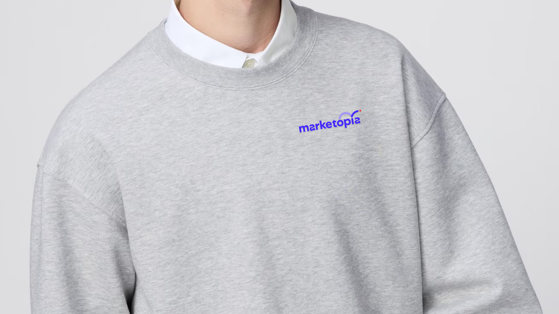
We introduced soft, flowing curves into the letterforms and created a graphic path that moves through the identity. A small red dot represents the point of sale, traveling along that path as a visual metaphor for strategy, movement, and progress. The result feels smart and professional, but still has plenty of personality.